- Text Self Portrait: we were supposed to make our face out of symbols or letters that are on the keyboard.
- This was for Digital Design I.
- The design process was mostly trying to figure out what letters and symbols to use. My inspiration was my face. It was put together with letters and symbols. I used Photoshop to make this. It is finished.
- The only problem I had was trying to figure what to use.
- My assessment is that I think that it didn't turnout to bad.
Dakotas Blog
Friday, December 17, 2010
Text Self Portrait
Famous for 15 Minutes
- Famous for 15 Minutes: we had to be like Andy Warhol and make some art like he did.
- This was for Digital Design I.
- The design process was easy. We had to take a picture, cut it out, then pick a really cool layer style.
- I didn't have any problems. The main one was trying to pick a layer style.
- My assessment is that this assignment turned out really cool. (:
Parody Sign
- Parody sign: we had to make a parody sign of a regular street sign.
- This was designed for Digital Design I.
- The design process was easy. All I did was transform some of the people to make it look like one is falling and one is pushing the falling person. I used Photoshop. This project is finished.
- I didn't have any problems.
- My assessment is that it doesn't look to bad for it being my first project for Digital Design.
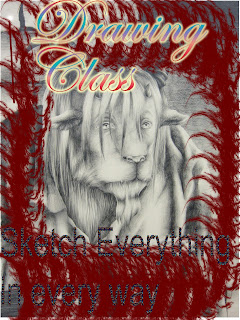
Drawing Class Poster

- This was made for Digital Design I.
- My inspiration was to use something that looked like it was drawn so that it would go with the theme. I used Photoshop to make this. And it is finished.
- I mainly had a problem with trying to find a brush style to "paint" with.
- My assessment is that the text is kind of hard to read and that I should have used a different brush style to "paint" with.
Cyborg
- Cyborg: we had to make it look like our body had robotic parts.
- This was for Digital Design I.
- I didn't have any inspiration, I just went with it. I used Photoshop to finish this project.
- My biggest problem was trying to get my fire eyes to look normal.
- My assessmnet would be that I should have worked on the eyes to make them look real life-like.
Thursday, November 4, 2010
Whats on your mind
This project is called whats on your mind and i based it on my interest of the UFC. I am pretty pleased with how it turned out but i wish the things that were coming out flowed together better. What we were supposed to do for the project was to cut open our head and put things that we think about come out of our head. I did this for my digital design class. The only problems that i really had was cutting out the people.
Friday, October 22, 2010
Sign Project
I did this project in digital design and we had to take a sign and alter it to something else. I changed the sign from its original tripping hazard sign. It came out pretty well but i think it could of been better
Subscribe to:
Comments (Atom)


